


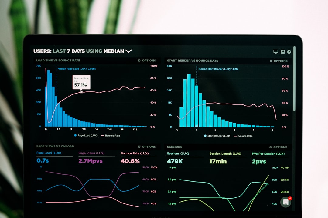
How can GCC facility managers transform raw operational data into actionable strategic insights? In today’s competitive Gulf markets, data-driven decision-making separates industry leaders from the rest. Consequently, static monthly reports no longer suffice for dynamic asset management. Performance dashboards KPI visualization provides the critical solution. This real-time approach empowers stakeholders with immediate visibility into facility health, operational efficiency, and financial performance. Therefore, mastering this tool is essential for modern facility management success across the region.
Furthermore, the GCC’s rapid infrastructure development demands sophisticated management tools. From smart cities in Saudi Arabia to mega-projects in the UAE, facility complexity is increasing. Additionally, stakeholders now expect transparent, accessible reporting on their investments. Real-time data visualization meets this demand effectively. It converts complex metrics into intuitive charts and graphs. Moreover, it aligns operational activities with broader business objectives. This alignment is crucial for justifying budgets and demonstrating value in a results-oriented market.
At Allianze HR Consultancy, we’ve successfully placed 10,000+ professionals across UAE, Saudi Arabia, Qatar, and Kuwait. Furthermore, our 5+ years of GCC expertise supports clients from 50+ countries. Our recruitment extends to technical roles that implement and manage these very systems. Moreover, our Ministry of External Affairs (India) RA license ensures compliance in all staffing solutions. Therefore, contact our recruitment specialists for expert guidance on building teams that leverage data for operational excellence.
Understanding Modern Facility Management Analytics
Modern facility management transcends basic maintenance tracking. Today, it encompasses energy sustainability, space utilization, occupant experience, and lifecycle costing. Consequently, managers require a holistic view of numerous data streams. Real-time dashboards aggregate this information seamlessly. They pull data from IoT sensors, work order systems, and utility meters. Additionally, they integrate with financial and HR platforms for a complete picture.
Specifically, GCC facilities face unique analytical challenges. Extreme climate conditions significantly impact energy consumption and asset longevity. Moreover, diverse international workforces require careful management of accommodation and welfare metrics. A robust dashboard centralizes these concerns. For example, it can correlate outdoor temperature with chiller plant efficiency instantly. This capability enables proactive adjustments, reducing costs and preventing failures.
Key metrics for GCC facilities typically include:
- Energy Consumption Intensity (ECI) per square meter
- Preventive Maintenance Compliance Rate
- Space Utilization and Occupancy Efficiency
- Tenant Satisfaction Index scores
- Annualized Total Cost of Ownership for key assets
- Health and Safety Incident Frequency Rate
Implementing these analytics requires both technology and skilled personnel. Therefore, strategic hiring becomes a foundational step. Furthermore, aligning dashboard design with organizational goals ensures relevance and adoption. Ultimately, the right analytics framework turns facility management from a cost center into a value driver.
Performance Dashboards KPI Visualization Strategic Overview
A strategic performance dashboards KPI visualization initiative begins with clear objectives. What decisions must stakeholders make? What outcomes define success? Answering these questions shapes the entire project. Furthermore, in the GCC context, dashboards must serve diverse audiences. Executive sponsors need high-level financial and risk metrics. Conversely, operational teams require granular, task-oriented data. Therefore, a tiered visualization approach works best.
The core value lies in real-time data synthesis. Instead of waiting for month-end reports, managers see live trends. This immediacy enables rapid response to anomalies. For instance, a sudden spike in water usage triggers an immediate investigation. Moreover, visualizations like heat maps and trend lines make patterns obvious. Complex data becomes intuitively understandable. This clarity improves communication across departments and with external partners.
Critical strategic considerations include data governance and source integrity. Firstly, establish protocols for data collection and validation. Secondly, define ownership for each KPI. Thirdly, ensure the technology stack integrates with existing systems. Additionally, consider mobile accessibility for managers on-site. Finally, plan for regular reviews and iterative improvements. A dashboard is not a set-and-forget tool. It must evolve with the business and the regulatory landscape, including standards from the International Facility Management Association.
Successful implementation delivers tangible benefits. Operational efficiency improves through identified bottlenecks. Financial performance strengthens via cost avoidance and optimization. Moreover, stakeholder confidence grows with transparent reporting. This strategic tool ultimately supports sustainable facility management practices across the Gulf region.
Legal Framework and Compliance Standards
GCC facility management operates within a strict regulatory environment. Compliance is non-negotiable. Consequently, performance dashboards must track and demonstrate adherence to various standards. These include local municipal regulations, civil defense codes, and environmental mandates. For example, Dubai’s Green Building Regulations impose specific energy and water benchmarks. A dashboard should visualize performance against these legal thresholds in real time.
Furthermore, international standards often influence local practices. Many GCC projects require alignment with ISO 41001 for Facility Management. Additionally, occupational health and safety standards are paramount. Dashboards can monitor compliance with guidelines from the International Labour Organization. This includes tracking training certifications, audit findings, and incident reports. Visual alerts for expiring permits or licenses prevent costly violations.
Key compliance metrics to visualize include:
- Regulatory inspection pass/fail rates and corrective action closure
- Utility consumption against government-mandated sustainability targets
- Indoor air quality readings versus World Health Organization guidelines
- Fire system testing and maintenance compliance schedules
- Waste management and recycling rates as per local authority requirements
Therefore, integrating compliance tracking into the KPI dashboard is essential. It transforms a reactive, document-heavy process into a proactive, visual management system. Moreover, it creates an auditable trail for authorities and senior management. This proactive stance minimizes legal risk and enhances corporate reputation in the region.
Performance Dashboards KPI Visualization Best Practices
Effective performance dashboards KPI visualization follows established best practices. First, adhere to the principle of “less is more.” Overloading a screen with metrics causes confusion. Instead, focus on the 10-15 most critical KPIs that drive decisions. Furthermore, organize information hierarchically. A summary view should allow drilling down into detailed operational data. This structure caters to different user needs without overwhelming anyone.
Second, use intuitive visual encoding. Color, size, and position should convey meaning instantly. For example, use red for metrics requiring immediate action and green for those on target. However, be mindful of color blindness. Additionally, select the right chart type for the data. Time-series data suits line graphs. Comparisons work well with bar charts. Meanwhile, proportions are clear in pie or donut charts. Consistency in design across all dashboards aids user comprehension and speed.
Third, ensure real-time data reliability and context. A live number is useless without a benchmark or target. Always display current performance against a goal or historical average. Moreover, include brief annotations for significant spikes or drops. For instance, a note explaining a high energy day was due to an external event. This context prevents misinterpretation and supports accurate decision-making. These practices align with global insights on data-driven urban management from the World Bank.
Finally, prioritize user experience and training. The most sophisticated dashboard fails if users cannot navigate it. Conduct training sessions and provide clear documentation. Additionally, establish feedback loops for continuous improvement. Regularly ask stakeholders if the dashboard provides the insights they need. Consequently, the tool remains relevant, used, and valuable, maximizing the return on your technology investment.
Documentation and Processing Steps
Implementing a real-time KPI dashboard is a structured project. It requires meticulous planning and documentation. The first step involves a comprehensive needs assessment. Interview all stakeholder groups to identify their data requirements and decision-making processes. Document these needs in a formal requirements specification. This document becomes the project blueprint. It guides technology selection and configuration.
Next, map your data sources and architecture. Identify every system that will feed data into the dashboard. Common sources include Building Management Systems (BMS), Computerized Maintenance Management Systems (CMMS), and utility provider portals. Furthermore, assess the quality and accessibility of this data. You may need to clean historical data or implement new sensors. Subsequently, design the data integration pipeline. This often involves middleware or API connections to ensure smooth, automated data flow.
The development phase follows. Configure the dashboard software according to your design. This includes creating user accounts with appropriate permission levels. Moreover, build the visualizations and set up automated alerts for threshold breaches. Crucially, develop supporting documentation:
- KPI Definition Sheets: Clear explanations of each metric, its calculation, and its owner.
- User Manuals: Step-by-step guides for navigating and interpreting the dashboard.
- Data Governance Policy: Rules for data entry, modification, and access control.
- Support Process: Contacts and procedures for technical issues or change requests.
Finally, execute a phased rollout. Begin with a pilot group for testing and feedback. Then, train all users thoroughly before full launch. This methodical approach, supported by strong documentation, ensures a smooth implementation and high user adoption rates from day one.
Performance Dashboards KPI Visualization Implementation Timeline
A realistic performance dashboards KPI visualization implementation spans 8 to 16 weeks. The timeline depends on facility complexity, data readiness, and stakeholder availability. Phase One, covering planning and design, typically takes 2-3 weeks. This phase finalizes requirements and selects the technology platform. Furthermore, it secures budget approval and assembles the project team. Clear milestones here prevent scope creep later.
Phase Two focuses on data preparation and lasts 3-4 weeks. This critical stage involves connecting to data sources and ensuring data quality. Often, this uncovers challenges with legacy systems or inconsistent data formats. Consequently, additional time for data cleansing may be needed. Meanwhile, initial dashboard wireframes and mock-ups are developed for stakeholder review. Alignment with local regulations, such as UAE green building regulations, is confirmed.
Phase Three is the build and test phase, requiring 4-6 weeks. Developers configure the dashboard, build visualizations, and set up integrations. Subsequently, rigorous testing occurs. This includes data accuracy tests, user acceptance testing (UAT), and system performance checks. Feedback from UAT is incorporated into refinements. Moreover, training materials and support documentation are finalized during this period. Parallelly, change management communications prepare the organization for the new tool.
The final phase is deployment and go-live, taking 1-2 weeks. A soft launch with a limited user group occurs first. This allows for real-world validation and final tweaks. Then, organization-wide rollout and training sessions commence. Post-launch, a 30-day hyper-care period provides intensive support. Finally, the project transitions to ongoing maintenance and iterative enhancement, ensuring the dashboard evolves with business needs.
Common Challenges and Solutions
Implementing real-time KPI dashboards presents several common challenges. Firstly, data silos and poor quality often hinder progress. Different departments may use incompatible systems. Moreover, historical data might be inconsistent or incomplete. The solution is a strong data governance initiative from the start. Appoint a data steward. Furthermore, invest in necessary data cleansing and integration tools before dashboard development begins.
Secondly, user resistance can derail adoption. Staff may be comfortable with old reports or fear increased scrutiny. Overcoming this requires inclusive change management. Involve key users in the design process early. Additionally, demonstrate the dashboard’s value in making their jobs easier, not harder. Provide comprehensive training and highlight quick wins. For example, show how it automates tedious manual reporting tasks.
Thirdly, selecting the wrong technology is a major risk. The market offers countless dashboard tools with varying features and costs. The solution is a thorough vendor evaluation against your specific requirements. Consider scalability, security, and mobile access. Moreover, ensure the tool can integrate with your existing facility management and enterprise systems. Proof-of-concept trials with shortlisted vendors provide valuable insights before full commitment.
Finally, a lack of clear ownership leads to dashboard neglect. After launch, the tool must be actively managed. Therefore, assign an owner or committee responsible for its content and evolution. This team should review KPI relevance quarterly. Additionally, they should incorporate new data sources and user feedback. Consequently, the dashboard remains a living, valuable asset rather than a forgotten project, supporting long-term strategic goals.
Expert Recommendations for Success
For GCC employers, success with performance dashboards requires a tailored approach. Begin by aligning the initiative with regional strategic visions like Saudi Vision 2030 or UAE Centennial 2071. Focus on KPIs that matter for sustainability and operational excellence in this market. Furthermore, ensure your dashboard respects cultural preferences for data presentation and reporting hierarchies. This cultural alignment increases executive sponsorship and user buy-in.
Invest in the right talent. The technology is only as good as the people managing it. You need analysts who understand both data visualization and facility operations. Moreover, you need champions who can promote the tool across the organization. Partnering with a specialized recruiter like Allianze HR ensures access to this niche talent pool. We connect you with professionals skilled in implementing these very systems across the Gulf.
Start with a focused pilot project. Choose a single facility or a specific department. Then, demonstrate clear value before expanding. For example, implement a dashboard for energy management first. Show tangible cost savings. This success builds credibility and secures funding for broader rollout. Additionally, leverage global standards and resources, such as those from the World Health Organization on workplace health metrics, to bolster your KPI selection.
Finally, foster a data-driven culture. Leadership must consistently use the dashboard in meetings and decision-making. Reward teams for improving their visualized metrics. Moreover, integrate dashboard insights into regular performance reviews. This cultural shift ensures the tool becomes embedded in daily operations. Ultimately, it transforms how your organization manages facilities, drives efficiency, and reports to stakeholders across the GCC.
Frequently Asked Questions About Performance Dashboards KPI Visualization
What is the primary benefit of performance dashboards KPI visualization?
The primary benefit is real-time, actionable insight for faster, better decision-making. Furthermore, it consolidates disparate data into a single, visual interface. This enhances operational transparency and accountability. Therefore, managers can identify and address issues proactively, improving efficiency and stakeholder confidence.
What are the most critical KPIs for a GCC facility management dashboard?
Critical KPIs include Energy Consumption Intensity, maintenance backlog, space utilization rates, tenant satisfaction scores, and compliance audit results. Additionally, region-specific metrics like water consumption and chiller plant efficiency are vital due to the climate. Moreover, tracking against local sustainability regulations is mandatory.
How do we ensure data security in a real-time dashboard?
Implement role-based access controls to restrict data by user profile. Furthermore, use secure cloud or on-premise hosting with encryption for data in transit and at rest. Additionally, conduct regular security audits and ensure your vendor complies with international data protection standards. Consequently, sensitive operational and financial data remains protected.
Can these dashboards integrate with existing facility management software?
Yes, most modern dashboard platforms offer API integrations or connectors for common CMMS, BMS, and ERP systems. However, a technical assessment during planning is crucial. Specifically, verify compatibility with your specific software versions. Moreover, middleware solutions can bridge gaps between legacy systems and new visualization tools.